
Readability and colour
|
"Its like putting up a green stop sign at a road intersection because it matches the colour of a nearby building." - Rosenfeld and Morville Information Architecture for the World Wide Web |
Colour use
Colour blindness affects about 8% of the male population (the deficiency is sex linked). If you think you may be colour blind, I would suggest you look through an online version of the Ishihara colour blindness test.
Many modern computer video cards can display thousands (16 bit colour) or millions (24 bit colour) of colours. Colour is often measured in terms of the HSV model, standing for Hue, Saturation and Value:
- Hue
-
Place in the colour spectrum, from red to violet. Hue can be measured in terms of spectral wavelength
- Saturation (or Chroma)
- Measures the purity of colour. As saturation reaches zero, colours turn to shades of grey. Most natural scenes under daylight are of lowish saturation, colourful clothes and paints have become cheaply available since the development of synthetic dyes in the 19th century.
- Value (or Intensity, Luminance)
- Darkness of the colour - as the value approaches zero, the colours
turn to black
Activity
If you have a painting or graphics program such as CorelDRAW or Paintshop Pro, load the program and find the colour picker tool. Select the HSV option, and play with the colour selections. Gain understanding of the interplay between the three variables.
Colour preferences can be cultural, and possibly psychological from deep evolutionary memories, but may also be drummed into us by convention (red means stop). Some guidelines are available from human computer interaction research:
- Don't use colours which have conventional meaning (red is stop, blue underlined is hyperlink) in ways which work against the meaning.
- For item differentiation, use between three and seven colours to match user's short term memory capacity
- For item ordering, use the spectral order: red, orange, yellow green, blue, indigo, violet
| Good order | 1 | 2 | 3 | 4 | 5 |
| Not so good | 1 | 2 | 3 | 4 | 5 |
Some further guidelines from colour vision physiology:
- Use red and green in the eye's central focusing area, and avoid them on the periphery
- Never use red text on a green background or vice versa - especially if the saturation is high
- Use familiar colour codings
Some people won't see colour, and displays vary
- Use additional coding - e.g. shape, size, texture (look at a photocopier control panel - the buttons are all different shapes, sizes and have symbols on them)
- Avoid very subtle differences in symbolic illustrations or icons
The Apple interface guidelines suggest that you should design computer interfaces in monochrome first, then add colour. This might be a good general principle to adopt for Web pages.
Checklist for text readability
The following checklist can be applied to pages:
- Does the page use text and background colours which are well contrasted?
- Good pages will use well contrasted colours, with widely differing hues and a difference in value. Good pages will tend to avoid strongly saturated colour pairs for background and text.
| This text is well contrasted | This text is not so well contrasted | Can you read this at all? | Got a headache yet? |
- Does the page avoid inappropriate use of 'conventional' colours?
-
Any green stop signs, or red signs for go? Any use of blue text for anything other than a hyperlink? Any use of underlines for anything other than hyperlinks? Is the TEXT IN BLOCK CAPITALS?
- Do the page colours tie in with common Web conventions?
- Is the colour scheme roughly standard - do violet links mean something different? Has red been used as the link colour?
- Does the page work ignoring colours
- Very few modern displays can work in pure two colour monochrome, but would the page work in the absence of colours or in greyscale? Would there be enough separation of the tones? Are there symbols, differences in shape or size to differentiate the buttons and icons used?
- Does the page use background images as textures?
- Do the textures interfere with the text? Does the colour range of the image cause any distraction, or is it the contrast within the texture? Do you see any 'aliasing' of lines or edges in the texture with the text of the page?
- Does the page work without images?
- Can you make sense of the page with no images loaded? When the page first loads, do you see the alternative text displayed, and does the page reserve space for the images before they download?
- Does the page have things which blink present?
- Possibly acceptable in marketing or in some kinds of educational material - mostly inappropriate.
Example Pages
The following are some example pages which run the gamut of colour use from the minimal to the heavy. Most of these pages are trying to communicate information.
- British Broadcasting Corporation
- David Bowie
- Backspace: Mute: Cloning
- Anne's guide to homepage design
- Cascading style sheets technical reference (you are not expected to read the information!)
When evaluating pages with the checklist, it might be appropriate to
- load the page with images switched off if your browser allows this
- reload the page with images switched on again, but setting your browser to ignore the page colours
In MS Internet Explorer 4, you can switch off image loading by
- selecting View | Internet Options from the View menu
- selecting the Advanced tab in the Internet Options dialog which appears
- scrolling down the list of options to the Multimedia section
- un-checking the box next to 'Show pictures'
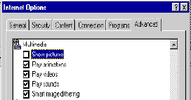
- Clicking OK to accept change
Remember to check the 'Show pictures' option before finishing your session!